聯系方式
服務熱線:0531-85980985
聯系人: 寧經理 手機:13953116782 電話:15990999232 郵箱:499589624@qq.com 地址:濟南市槐蔭區清河北路11號(美里新居南門斜對面)亞德森工廠店
服裝色彩搭配的技巧要注意什么?
來源:http://www.tbjrw.cn 日期:2023-08-21 發布人:
色彩配比
Color ratio
色彩配比是服裝色彩設計的一個主要法則,通過調整色彩之間的比例關系,服裝的整體外觀效果也隨之改變。服裝色彩的比例,是隨形態和配置而產生的。也就是說,服裝配色組織中各種色彩的形狀、面積及位置、空間等相互關系的比例關系。服裝色彩設計所采用的比例歸納起來有三種:黃金比例、數列比例和反差比例。在進行服裝配色時,無論采取哪一種比例,其實質都是一定的面積比或一定的數列關系。
Color matching is a major principle in clothing color design. By adjusting the proportion relationship between colors, the overall appearance of clothing also changes accordingly. The proportion of clothing colors varies with form and configuration. That is to say, the proportional relationship between the shape, area, position, and space of various colors in clothing color matching organization. There are three types of proportions used in clothing color design: golden ratio, sequence ratio, and contrast ratio. When conducting clothing color matching, regardless of which ratio is adopted, the essence is a certain area ratio or a certain sequence relationship.
平衡設計
Balanced design
服裝色彩平衡設計是指服裝色彩設計的平衡原理,是一種手法常用的配色形式,通過色彩面積的分布,不同色相、明度、純度變化產生一種視覺上的平衡效果。在進行服裝設,由于這一系列基本因素的關系變化,必然會導致由于色彩的配比不同而形成的不同效果的服裝設計。
Clothing color balance design refers to the principle of balance in clothing color design, which is a commonly used color matching method that produces a visual balance effect through the distribution of color area, changes in color hue, brightness, and purity. When designing clothing, changes in the relationship between these basic factors will inevitably lead to different effects of clothing design due to different color ratios.


節奏設計
Rhythm design
服裝色彩的節奏有其不同的性格,不同性格的節奏表現出不同的色彩氣氛,不同強度的色彩表現出不同速度的運動感,因此,色彩的節奏是服裝整體美的重要組成部分。服裝色彩節奏設計常常具有以下特征:從類別上看,服裝設計的色彩通常不低于3~4個能形成連續節奏變化的色彩設計元素,其數量的增加常常可以加強色彩節奏的表現力。從形式上看,色彩元素相互交替,有規律地出現,方式是重復、漸變、交替;從造型上看,色彩節奏的視覺效果很大程度上取決于形成色彩節奏的元素所產生的造型特征。
The rhythm of clothing colors has different personalities. The rhythm of different personalities displays different color atmospheres, and colors of different intensities display different levels of sportiness. Therefore, the rhythm of colors is an important component of the overall beauty of clothing. Clothing color rhythm design often has the following characteristics: from a category perspective, the colors of clothing design are usually no less than 3-4 color design elements that can form continuous rhythm changes, and the increase in their quantity can often enhance the expressive power of color rhythm. From a formal perspective, color elements alternate with each other and appear in a regular manner, through repetition, gradient, and alternation; From a styling perspective, the visual effect of color rhythm largely depends on the styling features generated by the elements that form the color rhythm.
強調色設計
Accent color design
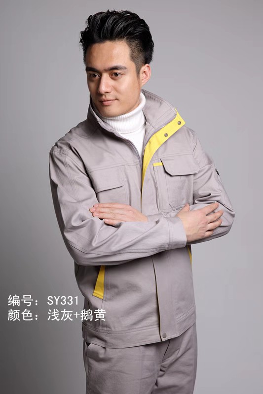
服裝色彩強調設計一般選取一種顏色做主打,強調過多的顏色容易分散人的注意力,造成無、無秩序的狀態。所謂色彩的主次是指服裝各要素在色彩上相互之間的關系,具體體現在服裝中各個組成部件之間的主從地位上。通常服裝設計作品會突出表現一個設計要點,而其他顏色的弱化是為了烘托主體,色彩和色彩之間負擔著不同的角色,主色與輔色相得益彰。
Clothing color emphasizes that design generally selects one color as the main theme, and emphasizing too many colors can easily distract people's attention, resulting in a state of centerlessness and disorder. The so-called primary and secondary colors refer to the relationship between various elements of clothing in terms of color, which is reflected in the dominant and subordinate positions between various components in clothing. Usually, clothing design works highlight a design point, while the weakening of other colors is to highlight the main body. Colors and colors bear different roles, and the main and auxiliary colors complement each other.
呼應設計
Echo design
呼應也稱關聯,在服裝配色中,呼應是使服裝色彩獲得統一、協調美感的常用方法。在服裝設計作品中,服裝各色彩之間并不是簡單、孤立的存在,而是在色彩的色調、明度、純度上帶有某種關聯性,它需要同一或同類色彩彼此之間的相互呼應。
Correspondence, also known as association, is a commonly used method in clothing color matching to achieve a unified and coordinated aesthetic feeling in clothing colors. In clothing design works, the colors of clothing are not simply isolated, but rather have a certain correlation in terms of color tone, brightness, and purity. It requires mutual resonance between the same or similar colors.
呼應使處于不同空間、不同位置的色彩產生相互對照的勢態,保持色彩間的相互關聯性,避免孤立的色彩出現,使服裝配色獲得相互聯系、整體統一的良好效果。
Echoing creates a trend of contrasting colors in different spaces and positions, maintaining the correlation between colors, avoiding isolated colors, and achieving a good effect of interconnectivity and overall unity in clothing color matching.
上一條:女性職業裝的穿著要求有哪些? | 下一條:職業裝不同風格的襯衫和套頭衫怎么搭配?
資訊MORE+
- 工作服跟工作服之間有什么區別呢? 2025-04-19
- 濟南工作服:要對員工工作服都有什么要求? 2025-04-18
- 濟南工作服定制的舒服度 2025-04-15
- 濟南工作服弄上油漆怎么快速洗干凈? 2025-04-14
- 為什么要穿職業裝 2025-04-12
- 工作服廠家的特點及流程 2025-04-11
- 工裝的衡量標準是什么? 2025-04-10
- 員工形象才是行走的企業名片 2025-04-09
- 濟南服裝廠:工作服的實用建議 2025-04-08
- 濟南職業裝根據行業需求設計制作 2025-04-07
- 工作服要怎么選便宜舒服? 2025-04-02
- 濟南職業裝傳統與現代碰撞出怎么樣的火花 2025-03-31
- 濟南工作服多元化 2025-03-28
- 用濟南工裝定做打造專屬企業形象 2025-03-24
- 濟南工裝定做怎么樣? 2025-03-24
- 濟南工裝定做選擇方式你知道嗎? 2025-03-21
- 濟南工裝定做:定制工裝,彰顯企業風采 2025-03-20
- 時尚征程的者?濟南服裝廠 2025-03-18
- 濟南職業裝怎么做到職場形象的塑造的? 2025-03-18
- 聽說濟南工作服是城市職場的實用風尚,到底為什么? 2025-03-17


